Digital / Branding / Investments / Case Studies
Apaya
APAYA is a no-code B2B SaaS that empowers digitally driven organizations to build, automate, and optimize payment flows with just a few clicks.
IKTOMI has entered into a deep partnership with Apaya by investing in the company itself as well as providing strategic, branding and user experience consultancy and execution. Together with the Apaya team we have designed the new brand and positioning as well as defined, designed and implemented the UX/UI for the platform.
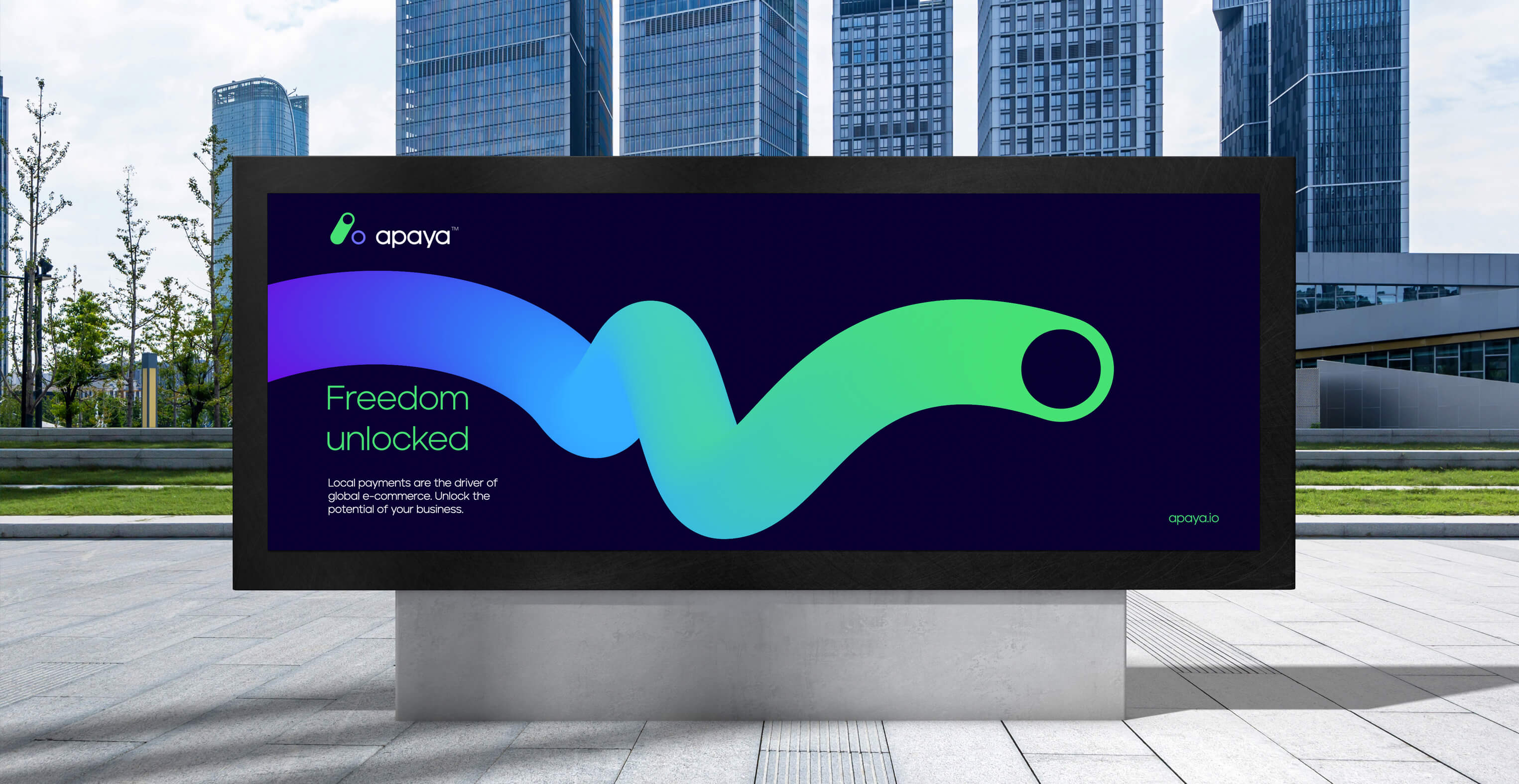
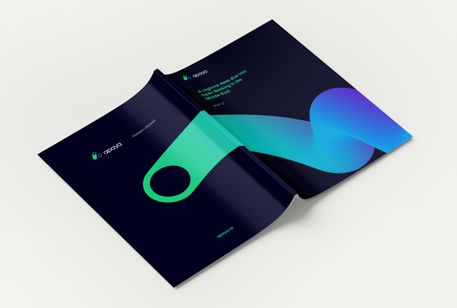
Distilling freedom into an identityOur approach to developing the new identity for APAYA started with the identification of the single core and uniquely distinguishing benefits of the service.
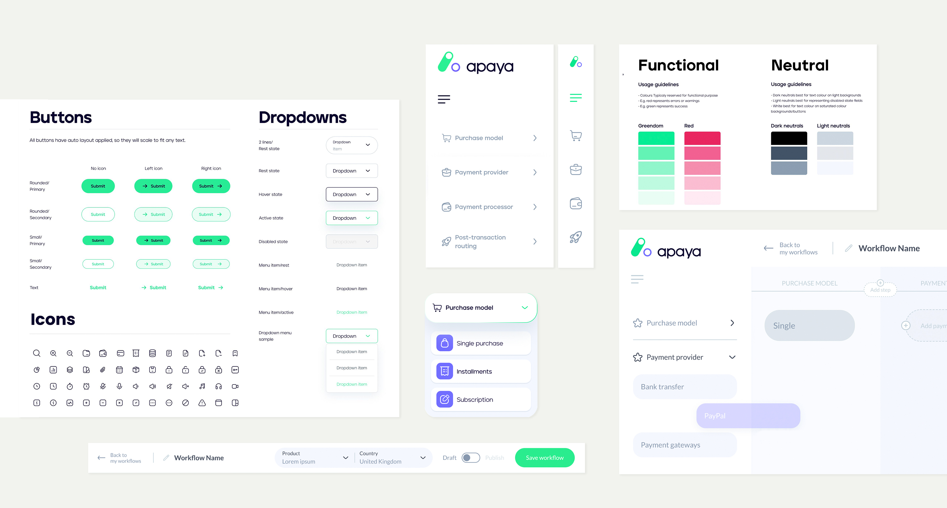
Given that APAYA was built on a core idea of flexibility, allowing business to add payment methods at will, we decided to create a design system that would use FREEDOM as its central tenet.
The ability to choose is the most fundamental aspect of freedom, and the toggle switch a universal representation of choice. We captured this core in the development of the logo through the use of the toggle switch and reinforced it with an identity that is dynamic exciting and future-forward.
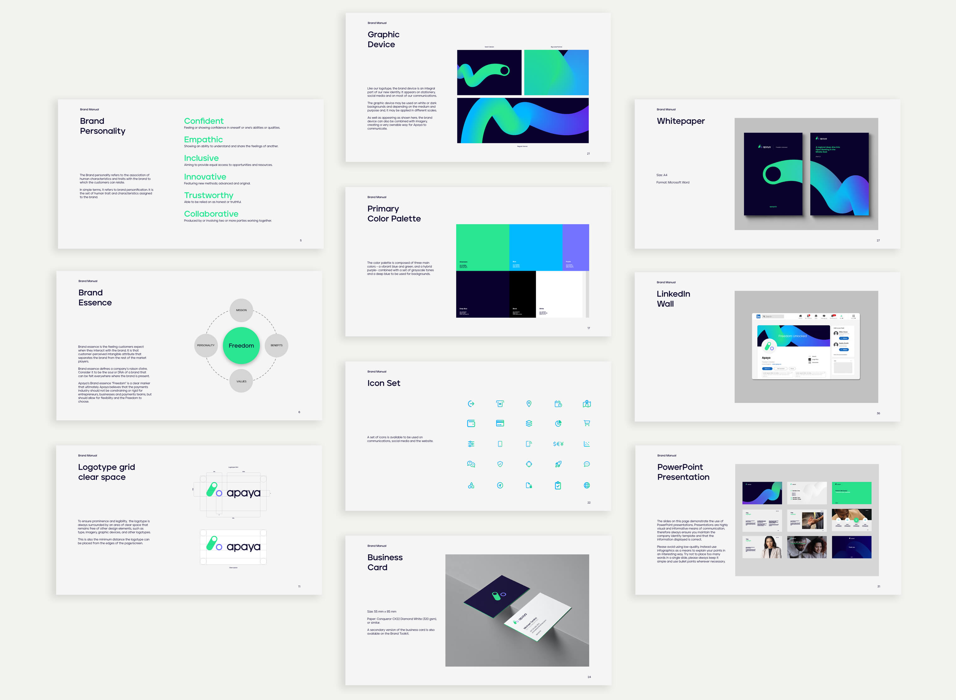

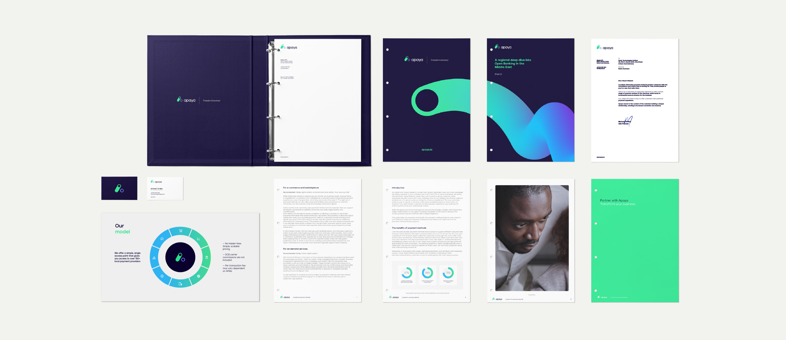
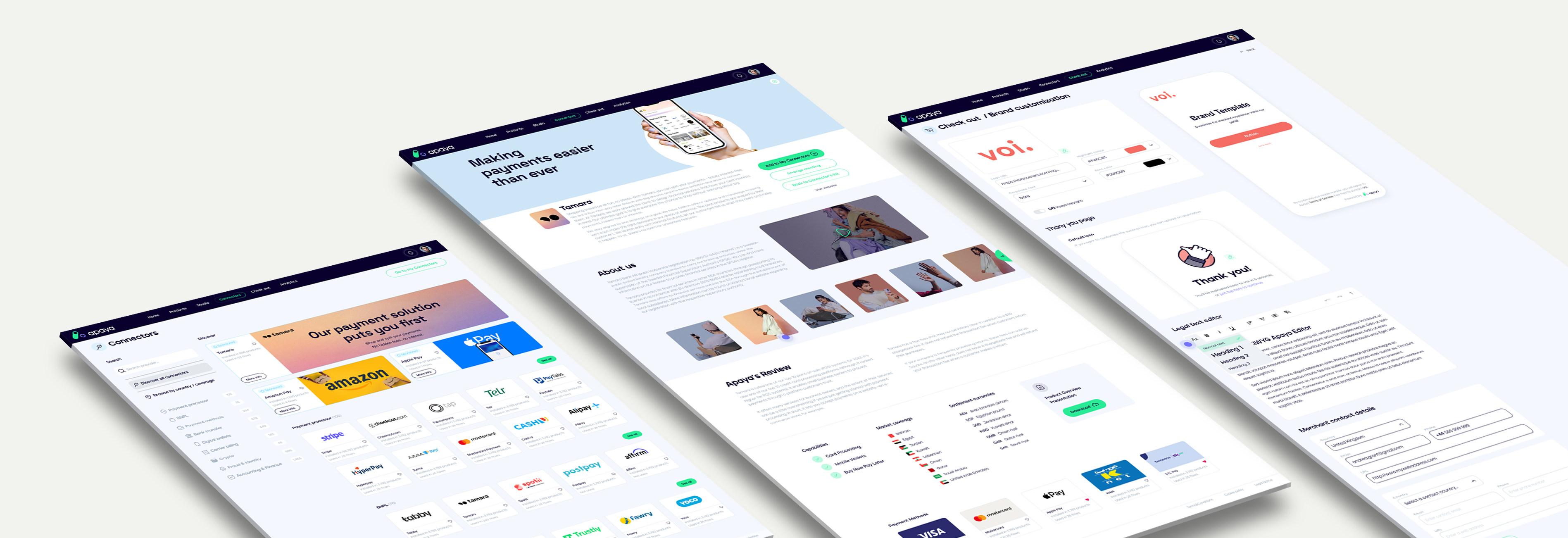
Brand consistency across the entire digital experience
Our mandate extended to taking the new brand identity and ensuring that the user experience is optimized, not only from a brand perspective but from a practical goal-oriented process
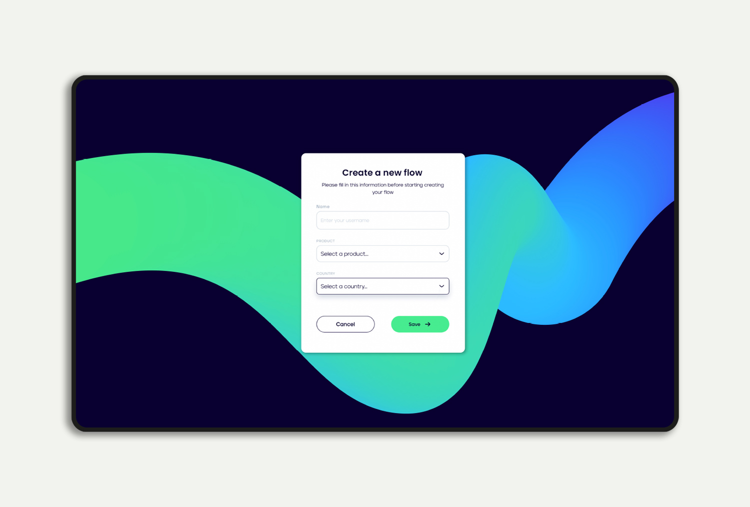
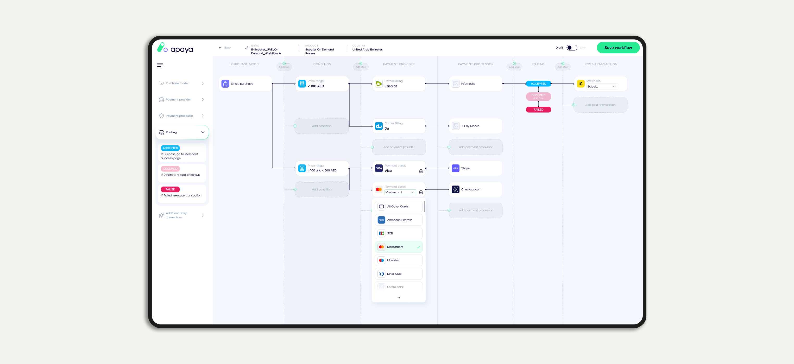
For Apaya’s direct users, i.e. merchants, the user journey is a fundamental and essential element of the whole process. With an ever-increasing range of payment providers and technologies (credit or debit cards, e-wallets, traditional banks, buy-now-pay-later, etc), the UX flow has to accommodate a multitude of possibilities and variables, but at the same time, it has to be smooth and easy to understand.
Designing for Apaya, our approach was to analyze each stage of the user cycle, reducing the complexity of the initial phases and increasing it over time. A concise and visual interface guides the first-time users in their initial steps. At first, the column-grid highlights only the essential steps, making it possible to create and test a basic payment flow right from the beginning. Over time, more possibilities and variants are presented to the users, including tools for fraud, customer identity, communications, logistics, etc.